The Spotify color palette has become one of the most recognizable brand visuals in the digital music industry. With its signature green and bold contrasting tones, Spotify has managed to stand out in a crowded market. But the Spotify color palette is more than just aesthetic—it is a carefully crafted brand identity tool with history, symbolism, and functionality behind every shade.
This color palette includes four core colors:
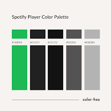
Spotify Green: #1DB954
Lighter Green: #1ED760
Black: #191414
White: #FFFFFF
In this article, we’ll take a closer look at the journey of the Spotify color palette, from its early beginnings to its modern-day refinements, including the reasoning behind each hex code, how the palette is applied across platforms, and what other brands can learn from Spotify’s approach.

The Early Days: Spotify’s Initial Color Choices
When Spotify launched in 2006 in Sweden, its visual identity was quite different from what we see today. The earliest versions of the Spotify color palette leaned heavily on bright, almost fluorescent green combined with playful, cartoon-like typography.
Primary Green (2006–2012): The green was louder, more neon-like, with hex codes close to #7AB800.
Complementary Black & White: The supporting colors were simple—basic black and white—to make the green pop even more.
Logo Style: A rounded bubble-like wordmark carried an informal, fun look, signaling Spotify’s role as a disruptor in how people consumed music.
The design worked at the time, but as the brand grew globally, Spotify realized the neon-heavy palette didn’t translate well across all devices, especially as mobile screens became the primary platform for listening.
The 2013 Redesign: Embracing Minimalism
By 2013, Spotify had become a mainstream platform, with millions of users streaming daily. This milestone marked the first significant update to the Spotify color palette.
Spotify Green Updated (#1DB954): The neon-like green was toned down to a richer, more sophisticated hex code—#1DB954. This shade remains Spotify’s signature green to this day.
Introduction of Black (#191414): Instead of generic black, Spotify adopted a custom near-black shade (#191414), which appears softer on screens and pairs seamlessly with green.
White (#FFFFFF): White became an integral part of the palette, ensuring clarity and contrast across app interfaces.
The redesign reflected a growing trend in design at the time—minimalism. Spotify’s refreshed color palette became cleaner, less playful, and more professional, while still retaining its unique brand energy.
The 2015 Brand Refresh: Expanding the Palette
In 2015, Spotify’s identity underwent a bold update. The Spotify color palette expanded beyond its three-color system, embracing gradients and secondary shades. This evolution was driven by the brand’s goal to reflect music’s emotional and cultural diversity.
Key updates included:
Secondary Green (#1ED760): A lighter, fresher green was introduced to add flexibility for gradients and UI accents.
Vibrant Tones for Campaigns: Spotify started experimenting with duotone images and campaign visuals using vibrant purples, blues, and pinks paired with its core palette.
Dynamic Usage: The Spotify color palette was no longer static—it adapted depending on the medium, whether for billboards, mobile apps, or social campaigns.
This expansion aligned with Spotify’s rapid global growth, positioning it not just as a music app but as a lifestyle brand.
Symbolism Behind the Colors
Every color in the Spotify color palette was chosen with intentional symbolism that aligns with the company’s values and brand promise.
Spotify Green (#1DB954): Represents innovation, freshness, and growth. Green is often associated with creativity and energy, aligning with Spotify’s role as a hub for music discovery.
Lighter Green (#1ED760): Adds vibrancy and dynamism, symbolizing movement and evolution in digital experiences.
Black (#191414): Conveys sophistication and focus. It provides balance against the vibrant greens, allowing content like album art to stand out.
White (#FFFFFF): Represents clarity, accessibility, and simplicity. It ensures usability across digital platforms and adds breathing room to Spotify’s design system.
Together, these colors embody Spotify’s mission: to make music accessible, engaging, and visually recognizable.
Implementation Across Platforms
The true power of the Spotify color palette lies in its consistent and strategic implementation across different platforms.
Mobile App UI
Spotify Green (#1DB954) highlights core interactive buttons like “Play.”
Black (#191414) serves as the background, making cover art and playlists visually dominant.
White (#FFFFFF) ensures typography and icons remain legible.
Web and Desktop
The palette translates seamlessly to larger screens, maintaining a consistent identity.
Gradients incorporating Lighter Green (#1ED760) add depth and interactivity.
Marketing Campaigns
Spotify’s duotone campaigns (for example, the iconic 2015 “Year in Music” ads) blended core palette shades with bold secondary tones.
The green remains the anchor, ensuring brand recognition across billboards, subway ads, and social media.
Merchandise and Branding
From t-shirts to office décor, the Spotify color palette is integrated into physical branding, reinforcing its digital-first identity.
The Evolution Continues
While the four-color Spotify color palette remains consistent, the way Spotify applies it continues to evolve.
Gradients and Custom Palettes: Spotify often pairs its greens with secondary palettes tailored for special events or partnerships.
Personalized Experiences: Features like Spotify Wrapped use brand greens while integrating user-specific palettes, making campaigns feel personal yet consistent.
Accessibility Adjustments: As digital accessibility gains attention, Spotify ensures that its palette maintains contrast ratios that meet accessibility standards for users with visual impairments.
The palette’s evolution is less about changing colors and more about adapting the existing system to new trends and technologies.
Lessons from Spotify Color Palette
There are several lessons brands and designers can take from the Spotify color palette:
Consistency Builds Recognition – By sticking with #1DB954 as its primary green for over a decade, Spotify has created one of the most recognizable digital brand colors in the world.
Simplicity Wins – The four-color palette is minimal yet powerful, ensuring usability across apps, ads, and merchandise.
Flexibility Is Key – While the palette is consistent, Spotify embraces gradients and secondary shades when needed, keeping the brand fresh.
Colors Should Reflect Identity – Spotify’s greens embody energy, discovery, and growth—values that resonate with its mission.
Conclusion
The Spotify color palette has been instrumental in establishing its brand identity in a competitive digital landscape. From the neon shades of its early days to the minimalist redesign in 2013 and the expansion in 2015, Spotify’s visual identity has evolved alongside its global growth.
Today, the palette’s four hex codes—#1DB954, #1ED760, #191414, and #FFFFFF—serve not only as design elements but as symbols of innovation, accessibility, and cultural influence. The consistency, flexibility, and thoughtfulness behind Spotify’s color palette demonstrate how powerful visual branding can be when done right.
For designers, marketers, and brands alike, the Spotify color palette offers a masterclass in how color shapes perception and builds lasting recognition.